
Horizon Recovery Treatment Outcomes
What Changed for the Young People in Our Care
Real changes in symptoms, coping skills, and brain activity from teens in Horizon’s program.
Clinically reviewed by Koren Hudson, MA, LPC, NCC on July 24, 2026. These are real results from our own clinical records — not a research study, and no outcome is guaranteed.
Download a summary (PDF)
Talk with our team
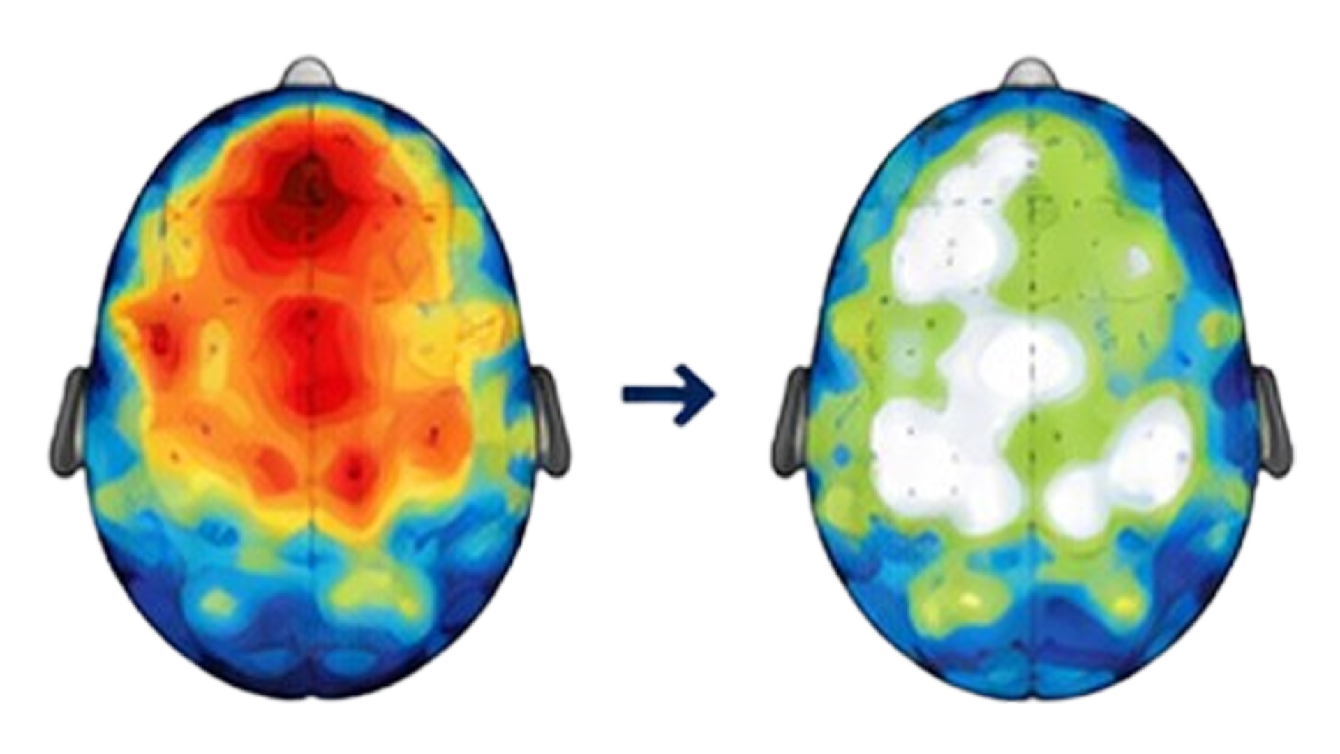
One teen’s brain map before and after 40 Neuro sessions
Warm colors show areas with more activity than expected for their age; cool colors show less. After 40 sessions, this teen’s brain activity moved closer to the healthy range (white/green) in key areas.

The Numbers Need The Full Story

Outcomes are more useful when you know what was measured, who was measured, and what the numbers actually mean.

01
THE RESIDENTIAL WINDOW

Nobody walks out of six weeks finished.

That was never the deal.

Everything on this page measures a thirty-to-sixty-day residential stay and nothing after it. Residential gets a young person stable; then PHP, then IOP, then outpatient.

Read every figure here as momentum — not a final score, but the head start your child carries into the next level of care.

02
WHO WE SERVE

These numbers come from a clinically complex population.

These numbers come from a clinically complex population, not a mild one.

612 young people in our current records
15 median age
3.8 average diagnoses per young person

A figure from a milder population is not comparable to a figure from this one — which is another question worth asking anywhere you call.

03
PUBLISHED COMPARISONS

Most programs show you an easier number.

Ask which one you are looking at.

Published comparison 20%

In a published comparison of 593 young people, 20% reliably improved over a nineteen-day average stay.

Another comparison 18.9%

In another study covering 12,547 young people, the figure was 18.9%.

Our screener figures sit in that range.

What competitors usually publish instead is "average score dropped six points" or "symptoms reduced 60%" — real numbers, easier bar, different question.

THE QUESTION TO ASK EVERYONE

Is that an average, or the share of individual kids who cleared a defined threshold?

04
THE 10-POINT BAR

Where the 10-point bar comes from

10 POINT BAR

It is not our number.

It is the standard statistical test for telling a real change from measurement noise, worked out from the reliability the test publisher reports for this questionnaire in this age group.

That calculation gives 9.2 points. We use 10, which is slightly stricter than the maths requires.

How to Read the Brain Map You Just Saw

A brain map is a painless recording of brain activity using sensors that rest on the scalp. There are no needles and no radiation.
  • White and green mark the healthy range.
  • Warm colors mark areas with more activity than expected.
  • Cool colors mark areas with less activity than expected.
  • In the example above, the warm “hot spots” shrink toward green after 40 sessions, meaning this teen’s brain activity moved closer to the healthy range.
This is one real teen’s data, shared with all identifying details removed. It shows what a change in brain activity can look like, notwhat will happen for every young person.


At A Glance: What Changed During Treatment

For the young people we measured at both intake anddischarge:
On a standard youth mental health scale where 65 or higher is elevated, average emotional symptom scores moved from the mid 65 down into the mid 53 by discharge.
Anxiety     and depression scores also moved out of the elevated range, and coping     and adaptive skills increased, not just symptoms decreasing.
Among     teens who started in the elevated range, half — 9 of 18 young people who arrived in the elevated range finished in the typical range for their age
You can see the full graphs and numbers below or download asummary to share with your child’s providers.
Download a summary (PDF)
Talk with our team

Symptoms Eased,
Measurably (BASC-3)

We track client progress using the Behavior Assessment System for Children (BASC-3), a standard clinical tool that measures emotional distress.

BEFORE AND AFTER TREATMENT

Average BASC-3 Scores At Intake And At Discharge

Average scores based on initial 30 youth outcomes. Emotional symptoms dropped from 65 to 53; Anxiety & depression dropped from 64 to 54.

BASC-3 averages, intake to discharge (30 young people)
Scale At intake At discharge Change Direction that's better
Emotional symptoms 64.9 53.4 −11.5 Lower is better
Anxiety & depression 63.9 53.3 −10.6 Lower is better

How to read this as a parent

1
A drop of 10–12 points is more than a full step across the distribution. Ten points is one standard deviation on this scale, so a 12-point move is a substantial change, not a small nudge.
2
An increase in adaptive skills shows that teens are gaining real tools to manage stress moving forward.
3
Among those who arrived in the elevated range, half finished in the typical range for their age — 9 of 18.
Aftercare

Most young people Stayed Well

Getting better in the building matters less than staying better at home. 1.1% of
young people returned to care within 90 days of discharge (N = 702 care episodes).
We count a return more than a week after discharge as a new episode, and a return inside a week  as a continuation of the same one. Measured a second way — any return, to any
level of care, at any time - 8.5% of young people came back (N = 612). The two figures use different denominators: the 90-day figure counts care epsidoes, the any-time figure counts individual young people. Figures cover all levels of care and are current through July 2026.
THE NEURO PROGRAM

Finishing it is what moves the number

Among young people in the Neuro Program who arrived in the elevated range, 50.0% of the 30 who completed the program reached clinically significant improvement — against 19.4% of the 36 who started and stopped early.

Completed the program
50.0%

N = 30

vs.
19.4%

N = 36

Clinically significant improvement

Same program — different completion

50.0% of young people who completed the program reached meaningful improvement, compared with 19.4% who started and stopped early.

By length of stay

65.0%

Stayed thirty to sixty days

N = 20 — cleared the bar

4.5%

Left inside thirty days

N = 22 — cleared the bar

Same program, same measurement.

By meaningful improvement we mean a clinically significant change: at least a 5-point drop on the PHQ-9, or a 4-point drop on the GAD-7, for a young person who arrived in the elevated range.

Source: Horizon clinical records, Neuro Program participants who scored in the elevated range at intake. Completers n = 30, non-completers n = 36; 30–59 day stays n = 20, under-30-day stays n = 22. A within-program comparison, not a randomised one — enrolment and completion are a family's choice.

Wondering what length of stay would make sense for your child?

Ask our team
THE NEURO PROGRAM

How to Read the Brain Map

A brain map is a painless recording of brain activity, taken with sensors that rest on the scalp — no needles, no radiation. White and green mark the healthy range; warm colors mark too much activity, cool colors too little.

This is one young person's data. A de-identified example of what you receive — not your child, and not a typical result. All identifying information has been removed.

De-identified example brain map at the start of the program

Before

At the start of the program. The map shows the measurement taken at the beginning of care.

De-identified example brain map after 40 sessions

After 40 sessions

A later measurement from the same young person. The images show measurement at both ends of care; they do not, by themselves, establish that the program caused the change.

Horizon produced and gave families 44 QEEG reports. Of those, 10 reached a 20-session review, and a handful reached 40 sessions. There is not enough data here to make an aggregate finding about brain change, and none is implied. These images show that measurement happens at both ends of care; the neuropsychology team interprets the reports, and families keep every report.

How to Read the Brain Map

01

At the start

A brain map is taken at the start of the program, with a written interpretation.

02

At 20 sessions

A second brain map is taken at 20 sessions, with another written interpretation.

03

At completion

A third map is taken at completion if the young person continues past 20 sessions.

Symptom measures are tracked separately. The PHQ-9 and GAD-7 are collected at intake and then weekly, with the final measure taken at discharge.

Important: The brain images demonstrate that measurement takes place. They are not presented as proof that the Neuro Program works, and this page does not make an aggregate claim about brain change.

Before you weigh these

How to read these numbers

This Isn't A Research Study

These are our own clinical records, rebuilt from the source each time we report them. No control group, no peer review, and no outcome is guaranteed. Where we can test a change, we say so: the symptom changes above clear statistical significance at with a medium-to-large effect, and met the reliable-change threshold.

We Don't Claim Cause

We report what happened for the young people we served. We don't claim we're the only reason it happened. Where another explanation is just as likely — a longer stay, a family who chose a program — we name it next to the figure.

Every Figure Carries Its Count

The number of young people behind a figure is on the figure. Ask us for the count behind any number here, or on any program's website. If we can't give you the N, we won't put the number in front of you.

Some Groups Are Small

The intake-to-discharge figures rest on 20 complete before-and-after tests. That's enough to show a real change, and small enough that the averages will move as more come in.

Nobody Is Left Out

Young people who didn't improve are inside every average on this page. We don't remove them, and we don't show a strong figure without the ones that run the other way.

Questions parents ask

Ask us anything here — and ask every
program you’re considering

Is 30 young people enough to trust?

What about the young people who didn’t improve?

What is the BASC-3, and why do you lead with it?

Do you guarantee my child will improve?

Those are averages — what about my child?

What happens to the diagnoses my child arrives with?

How do I know these numbers are current?

Ask us the hard question

Every figure here comes with someone who can walk you through how it was built. If you’re weighing a decision about your child, start there.