What Changed For The Young People in Our Care
Horizon Recovery Treatment Outcomes
Horizon's own outcomes data shows measurable change for the young people in our residential and outpatient care — with the number behind each figure, and the follow-up that shows what stayed.
Download a summary (PDF)
Talk with our team
Clinically reviewed by Koren Hudson, MA, LPC, NCC on July 24, 2026. These are real results from our own clinical records — not a research study, and no outcome is guaranteed.

Symptom scores fell from the elevated
range back toward typical

We track your child with the BASC-3, a standardized assessment where 50 is average for a young person their age, 60 or higher
is elevated, and 70 or higher is clinically significant. Below is what changed for the first 20 young people we tested at both ends of care.
Typical for age
Elevated
Clinically significant
Intake
Discharge

Emotional symptoms

64 → 55

The overall read on distress. Lower is better.

60 • Elevated 70 • Clinically Significant

On this scale, 10 points is one full standard deviation. A 9-point drop is close to a full step across the bell curve — the difference between distress that gets in the way of daily life and scores that look like other teenagers their age.

Anxiety and depression

63 → 55

What most families walk in the door carrying. Lower is better.

60 • Elevated 70 • Clinically Significant

About 1 in 3 young people who arrived in the elevated range had returned all the way to the typical range by the time they finished care.

Coping and adaptive skills

39 → 43

The one measure where higher is better — coping, relationships, self-reliance.

30 • Clinically Low 40 • At-Risk

Coping skills moved up but stayed below the typical range. Symptoms usually ease before skills catch up — building those takes longer than a residential stay, which is why the work continues at step-down and at home.

The briefer screeners insurers use agree. Among young people who arrived with elevated scores, about 32% reached meaningful improvement on the PHQ-9. N = 103 By meaningful improvement we mean a clinically significant change: at least a 5-point drop on the PHQ-9 or a 4-point drop on the GAD-7.

Aftercare

Most young people Stayed Well

About 5.8% of young people returned to care within 90 days of discharge — counting a return more than a week out as a new episode, and a return inside a week as a continuation of the same one. Measured a second way, any return to any level of care at any time, it's about 9%. Figures cover all levels of care through July 2026.
Returned within 90 days Did not return

How long a young person stays makes a difference

Length of StayReturned Within 90 DaysReached Meaningful Improvement
Under 30 days5.9%9.7%
30–59 days3.2%44.7%
60–89 days3.8%35.0%
90+ days0.0%25.0%

Leaving in the first month is the pattern most tied to not getting better—improvement jumps from under 10% to roughly 45% once a young person is past four weeks.

THE NEURO PROGRAM

Young people in the Neuro Program improved more

Among our residential clients, those who took part in the Neuro Program reached meaningful improvement at a higher rate than those who didn’t — even though they arrived with higher symptom scores.

Took part in the Neuro Program
N = 214
40.0%
Did not take part
N = 117
14.3%

Families chose the Neuro Program — we didn’t assign young people to it — and that group also stayed in care longer. So this is what happened for the young people who took part, not proof that the program alone caused it.

Color Scale
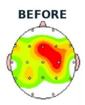
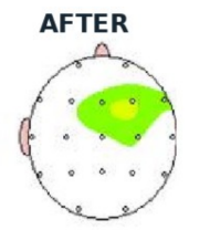
A brain map is a painless recording of brain activity, taken with sensors that rest on the scalp — no needles, no radiation. White and green mark the healthy range. Warm colors mark too much activity; cool colors mark too little.
Color Scale
A brain map is a painless recording of brain activity, taken with sensors that rest on the scalp — no needles, no radiation. White and green mark the healthy range. Warm colors mark too much activity; cool colors mark too little.

One young person's maps, showing a single measure of brain activity at the start of the program and after 40 sessions. All identifying information has been removed. This is one young person's data — it shows what the measurement looks like, not a typical result.

Before you weigh these

How to read these numbers

Nobody is left out

Young people who didn’t improve are inside every average on this page. We don’t remove them, and we don’t show a strong figure without the ones that run the other way.

Some groups are small

The intake-to-discharge figures rest on 20 complete before-and-after tests. That’s enough to show a real change, and small enough that the averages will move as more come in.

Every figure carries its count

The number of young people behind a figure is on the figure. Ask us for the count behind any number here, or on any program’s website.

This isn’t a research study

These are our own clinical records, rebuilt from the source each time we report them. No control group, no peer review, and no outcome is guaranteed. Your child’s path is their own.
Questions parents ask

Ask us anything here — and ask every
program you’re considering

Is 20 young people enough to trust?

Do you guarantee my child will improve?

Those are averages — what about my child?

What happens to the diagnoses my child arrives with?

How do I know these numbers are current?

Ask us the hard question

Every figure here comes with someone who can walk you through how it was built. If you’re weighing a decision about your child, start there.
Talk with our team
I’m a referring clinician